About the Client
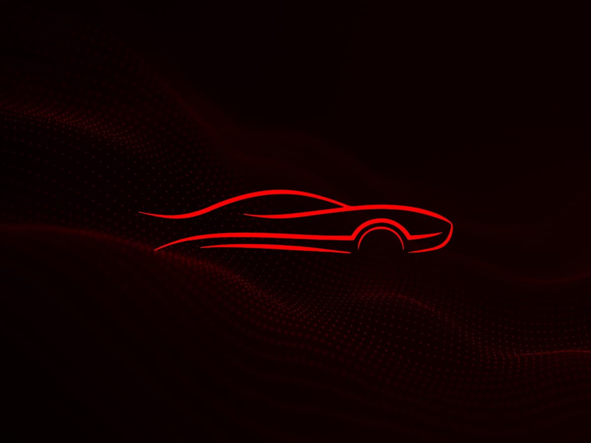
Crimson Fury
Crimson Fury is a fast-rising name in thermal management. Their flagship product, CHIPLIFE™, is built for data centers and life sciences — where heat isn't just a byproduct, it's a threat. They're not just solving for efficiency, they're building smarter systems that scale with precision.
The Challenge
Crimson Fury had the product. They had the expertise. But they didn't have a brand presence. There was no website. No typography. No digital look or feel. They needed a bold, high-speed brand identity and a one-page website that could communicate power, precision, and innovation — fast.
What they needed:
- Strong visual identity anchored in speed and confidence
- Custom typography that felt engineered and intentional
- A one-pager that delivered a punch, not just info
- Subtle movement and visual cues to reflect performance
The ZenBiz Fix
What we delivered.
We treated this like a design sprint. With minimal time on the clock, we delivered a race-ready experience.
Bold Branding From Scratch
We set the tone with a racing-inspired font stack and a dark UI contrast, using Crimson Red and British Racing Green not as decoration, but as directional accents. Every color choice had a job.
Sleek One-Page Web Design
One scroll. One message. No filler. From hero to footer, the site moves with rhythm and purpose — highlighting CHIPLIFE™, its benefits, and Crimson Fury's positioning as a next-gen provider.
Subtle Motion, Big Energy
On load, a custom moving logo element kicks things off — instantly giving visitors that high-performance vibe without going overboard.
Designed for First Impressions
This was more than a test project. This was the first step in defining Crimson Fury's entire digital identity. And it set the tone right.
The Results
Measurable impact.
In one sprint, Crimson Fury went from concept to commanding presence.
Full brand identity foundation: fonts, layout, color logic
A sleek, memorable first impression for prospects and partners
Confidence to scale outreach without second-guessing their online presence
Design flow that mirrors the product's purpose
Get Started
Transform Your
Online Presence.
Let's create a digital platform that reflects your ambitions and enriches your audience's experience.